Litprofit — Brand identity
- Brand identity
- Monogram
- Brand guidelines
- Company presentation
L and P interlocking, cut on the diagonal
- 36 pages
- Brand guidelines, from construction to applications
- Three products
- Presentation, website and calculator on one identity
What it changes
- The logoA red logo that looked like a shopNow: An L+P monogram with a hard diagonal cut
- ColourRedNow: One deep navy that carries everything
- Using itAd hocNow: 36 pages of guidelines; deck, site and calculator on them
How we approach a brand: we start from what the company actually does, not from a mood board. We look for one idea that explains the business in a single shape, draw it until it holds at every size, and only then choose colour and type. Before anything is handed over, we put it on the real things it will live on — because a logo that works on a slide and fails in use is not finished.
- 01The brief
Litprofit repairs and maintains refrigeration systems on ships and in industry, supplies spare parts and designs installations. Shipowners and engineers compare suppliers on precision. The old identity — a red logo — looked like a shop, not a repair yard.
- 02One idea: L and P, locked together
A monogram of an L and a P interlocking, with a hard diagonal cut through both — two parts machined to fit, the way the company works. It holds as a single mark on a container side and at sixteen pixels in a browser tab.
- 03The wordmark
LITPROFIT in a heavy, wide geometric sans, tightly spaced — engineered, not decorative. Supporting text in light, widely tracked capitals, and a "//" separator that runs through pages, labels and the site.
- 04One navy carries it
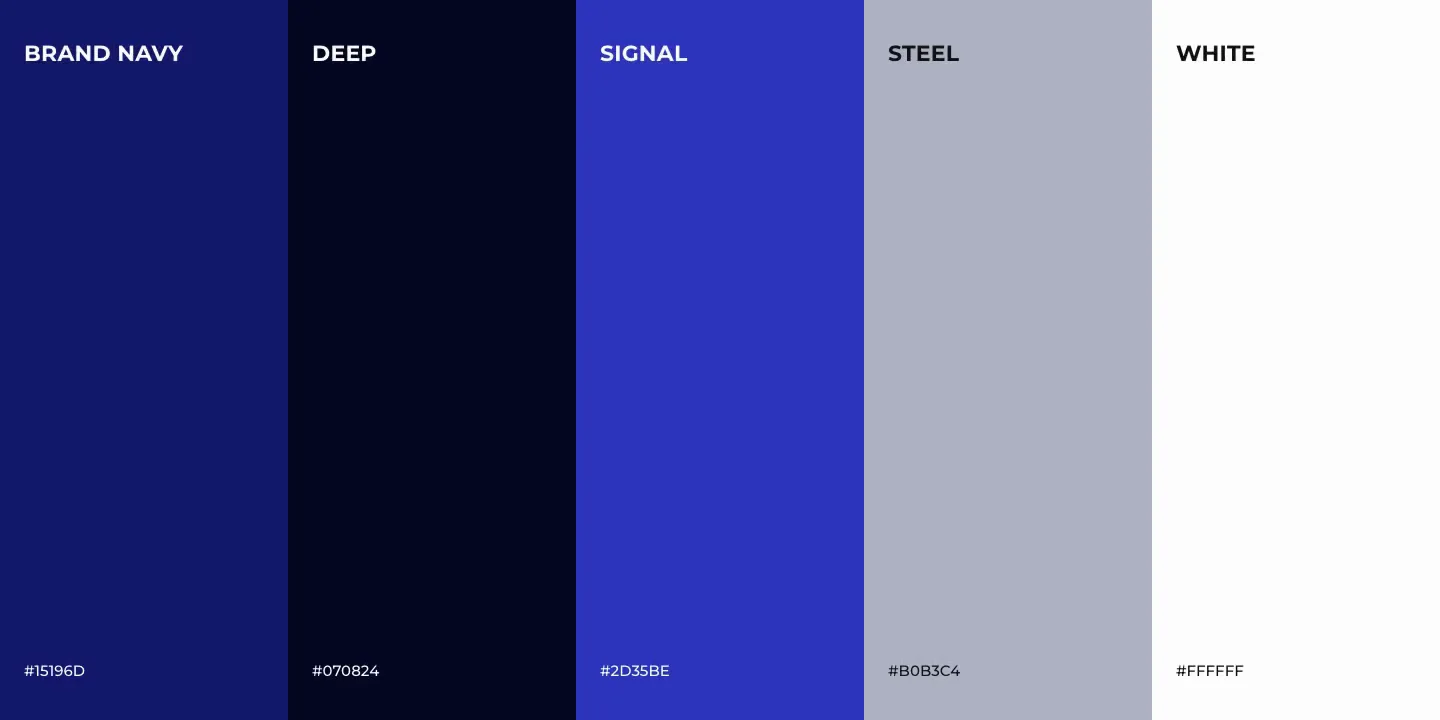
A deep indigo navy for grounds, containers and signs; white as the mark’s reversed form; grey as material; black as a separate ground, never a shade of navy. No red — the old logo’s red is gone.
- 05Photography: the real plant
Dark, low-key, industrial — compressors, machine rooms, the work itself. The navy sits over it without fighting it.
- 06Handover and use
Brand guidelines — 36 pages, from the mark to applications on trucks, containers and signage — and then the company presentation, the website in three languages and the project calculator, all on the same identity.
Same shape of problem on your side?
Fifteen minutes, no slides, and a reply within one working day.
Who picks up

“You will be talking to me, not to an account manager. I scope the work and I am on the build.”