Techno Software — Brand identity
- Brand identity
- Mark
- Generated pattern
- Print and stationery
The mark: a T of five, and the one that joins
- Five colours
- One cobalt, a night blue and three tints
- 25 logo files
- Every lockup and colourway, with the type in outlines
Logo
Colour
Cobalt
#1530D6
The brand: the hero, buttons, the card
Night
#050C3D
Text, and the darkest ground
Join
#9EADFF
The module that docks; the pattern's light tone
Haze
#C6CFFF
The pattern on blue; quiet rules
Paper
#F3F5FD
Alternate sections, forms
Type
Geist
Headlines and text
Aa Bb
Aa Bb Cc Dd Ee Ff Gg Hh Ii Jj Kk Ll Mm Nn Oo Pp Qq Rr Ss Tt Uu Vv Ww Xx Yy Zz 0123456789
Geist Mono
Labels, data, the coordinates
Aa Bb
Aa Bb Cc Dd Ee Ff Gg Hh Ii Jj Kk Ll Mm Nn Oo Pp Qq Rr Ss Tt Uu Vv Ww Xx Yy Zz 0123456789
Graphic element: the dither
Every picture on technosoftware.cz is drawn by code in three tones through a 4×4 Bayer matrix. These are the site’s own scenes, live. Hover or tap the mark to dock the module.
What it changes
- The markA new nameNow: A team of modules, and the one that joins
- PicturesNone of its ownNow: A pattern drawn by code
- A changed detailEvery file edited by handNow: One script regenerates the kit
How we approach a brand: we start from what the company actually does, not from a mood board. We look for one idea that explains the business in a single shape, draw it until it holds at every size, and only then choose colour and type. Before anything is handed over, we put it on the real things it will live on — here, a business card, a letterhead, an email signature and a slide.
- 01The brief
Techno Software Czech sells one thing: a senior engineer who joins your team and works in your stack. It is new, but it is a spin-off of a consultancy with 500 experts in five countries. The identity had to look like engineering, not like recruitment.
- 02One idea: the team, extended
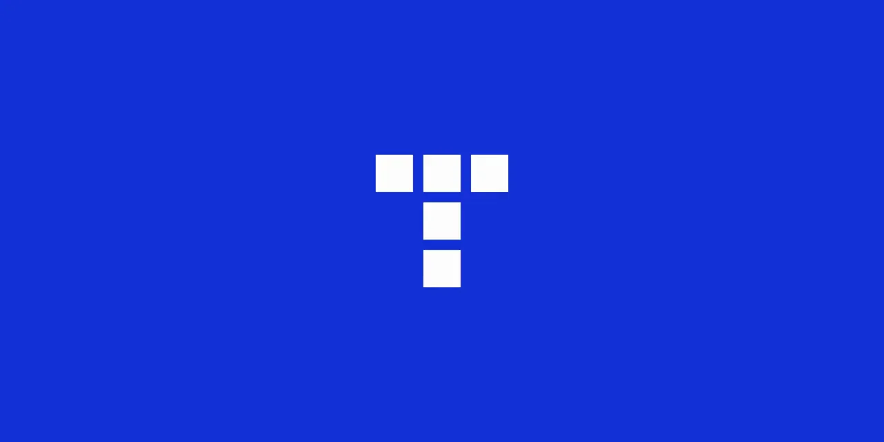
The mark is a T drawn from five square modules on a three-by-three grid. A sixth module, in a lighter blue, sits in the empty corner: the engineer who joins. On the site it docks when you hover over the logo. The whole service in one shape.
- 03One cobalt, and a pattern
A single cobalt carries the brand, with a night blue for text and two pale tints. In place of photography, a pattern drawn by code in three of those tones through a Bayer matrix, the dots of an old printer. It moves on screen and prints as a flat colour.

- 04The wordmark
Techno Software in Geist, with Czech below it in Geist Mono, widely spaced. The same two faces run through the site, the cards and the slides, so the system has one voice for headlines and one for data.

- 05Handover
A 16-page brand book, 25 logo files with the type turned to outlines, logo animations, business cards ready for print with bleed, an A4 letterhead with the footer Czech law requires, an email signature built to survive Outlook, LinkedIn templates and a seven-slide presentation. All of it is generated by one script: change the phone number once, and every file follows.
Same shape of problem on your side?
Fifteen minutes, no slides, and a reply within one working day.
Who picks up

“You will be talking to me, not to an account manager. I scope the work and I am on the build.”